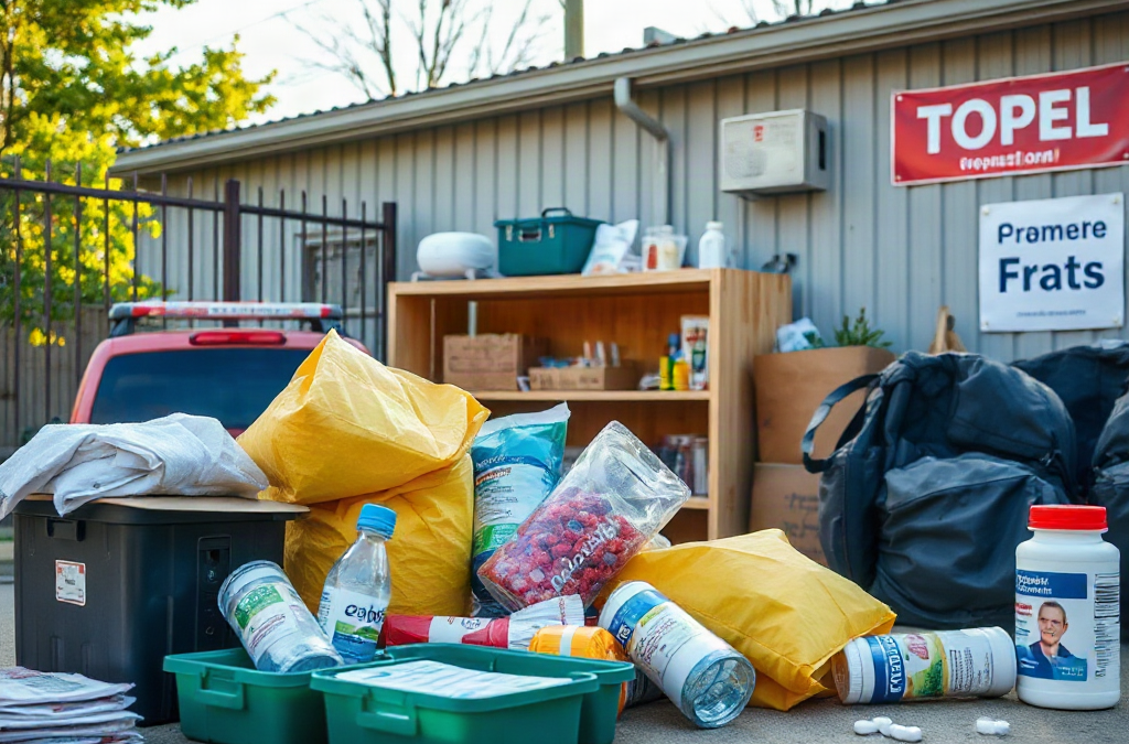
Pictures that illustrate emergency preparedness priorities should show the actions people must recognize first: securing water and medication, identifying exits and meeting places, protecting communication devices, and storing supplies where they can be reached quickly. Effective visuals use labeled examples, realistic room layouts, priority order, and clear contrasts between accessible essentials and overlooked hazards. A picture of a crowded supply shelf is less useful than one that shows water, first-aid items, flashlights, documents, and backup power arranged by purpose. Images should also reflect constraints such as darkness, mobility needs, limited storage, and interrupted phone service, because preparedness priorities change when normal routines fail.
What Preparedness Pictures Should Make Visible
Pictures are most useful when they turn an abstract readiness goal into a visible decision. A well-designed image should help someone identify what to do, what to locate, or what to correct without needing a long explanation. For emergency preparedness, that usually means showing immediate survival needs, movement through the home, reliable communication, and the conditions that make ordinary resources unavailable.
The strongest images communicate priority through composition. A flashlight placed beside a bed suggests nighttime access; a labeled water container near other essential supplies suggests deliberate storage; a marked exit route shows how people will leave rather than merely stating that evacuation matters. Images can also reveal hazards that a text list hides, such as a blocked hallway, supplies stored in a locked basement, or a phone charger located far from the sleeping area.
Compare a staged photograph of an overflowing emergency kit with a simple room diagram showing an exit, fire extinguisher, shoes, flashlight, and meeting point. The first may attract attention, but the second provides better decision support. It shows relationships: where an item is kept, who uses it, and what action follows. That distinction matters when stress, darkness, noise, or limited time reduces a person’s ability to interpret information.
When reviewing Pictures that illustrate emergency preparedness priorities, ask whether each image answers a practical question: What comes first? Where is it? How is it used? What could prevent access? If the picture cannot answer at least one of those questions, it may be decorative rather than instructional.

How to Show Supplies in Priority Order
Supply images should distinguish immediate needs from convenient extras. Water, essential medications, basic first aid, lighting, communication power, sanitation items, and important documents generally deserve more visual prominence than specialized equipment. The exact contents depend on the household and hazard, but the image should make the ordering logic visible instead of presenting every object as equally urgent.
A useful supply photograph can use separate containers or labeled zones: “drink and sanitation,” “medical,” “light and power,” and “documents and communication.” A compact apartment may need a small, portable arrangement near an exit, while a home with storage space may use a larger bin system. Showing both options prevents a common mistake: treating a large stockpile as automatically better when it is difficult to carry, rotate, or reach.
Pictures should include details that affect whether supplies work in practice. A battery-powered radio should be shown with spare batteries or an alternative charging method. Medication storage should account for access and replacement dates without displaying private information. Water containers should appear clean, sealed, and easy to lift. A first-aid kit should not be portrayed as a substitute for emergency medical care; its visual role is to support basic response while professional help or transportation may be delayed.
A compact review list can help editors or households check an image:
- Are the highest-priority items visually separated from optional gear?
- Can a person find and carry the essentials during a power outage?
- Does the image show maintenance, such as battery checks or medication replacement?
- Are mobility, child, pet, dietary, or communication needs represented where relevant?
One misleading approach is to show food and equipment without showing access, rotation, or use. A more credible image depicts a small kit being checked, labeled, and placed where it can be reached. Readers can then connect the objects to a routine rather than assuming that buying supplies completes the task.
Visualizing Evacuation, Communication, and Safety
Evacuation images should show movement and decisions, not merely a road or a packed bag. A floor plan can identify two ways out of a sleeping area, a meeting location outside the home, and a place where keys, shoes, mobility aids, or pet carriers are kept. A neighborhood map can show the difference between a primary route and an alternative route without implying that either route will remain open during a real event.
Communication deserves equal attention. A useful visual might connect a charged phone, written contact card, battery pack, radio, and out-of-area contact plan. The point is not to suggest that one device will solve every problem. Phone networks may be congested, internet service may be interrupted, and family members may be separated. Showing several communication paths makes the limitation clear and encourages people to record information somewhere other than a single phone.
Safety images also benefit from cause-and-effect detail. A picture of furniture secured to a wall explains why stabilization matters during shaking; an illustration of a generator placed outdoors can communicate the danger of enclosed use more clearly than a product photo. A visual about fire should distinguish an accessible extinguisher from an obstructed one and should avoid implying that every person should confront a growing fire rather than leave and seek help.
Consider two evacuation visuals: one shows a packed vehicle beside a full driveway, while the other shows a small go-bag, fuel planning, a route card, and a person checking on a neighbor with mobility limitations. The second conveys tradeoffs. Space, fuel, traffic, weather, and the needs of other people can alter the best choice. A picture becomes more credible when it shows those constraints rather than presenting evacuation as a simple trip from point A to point B.
Use Pictures that illustrate emergency preparedness priorities alongside short labels that name the action. “Exit through the rear door” or “meet at the mailbox” is more useful than a vague caption such as “be ready.”
Designing Useful Images for Different Households
There is no single visual layout that fits every household. Preparedness pictures should reflect the people, building, hazards, and resources being discussed. A high-rise resident may need stairwell awareness, a small grab bag, and instructions for avoiding elevators during certain emergencies. A rural household may need to show longer travel distances, backup water, livestock considerations, or limited access to services. The picture should not claim that one arrangement is universally correct.
Accessibility changes what counts as a good image. Use strong contrast, readable labels, uncluttered backgrounds, and icons that support rather than replace text. A household with a wheelchair user may need to show transfer planning, accessible exits, and backup assistance. Families with children can illustrate age-appropriate tasks, while pet owners may need carriers, leashes, food, and vaccination records. These details are not decorative additions; they determine whether a plan can be carried out.
Budget and storage limits also deserve honest treatment. A staged image filled with expensive equipment may discourage readers or create the impression that preparedness requires a special room. A better comparison shows a modest shelf, a portable bin, and ordinary household items assigned to emergency use. It can also distinguish items that should be purchased from actions that cost little, such as writing contacts on paper, choosing a meeting place, or practicing how to shut off utilities when appropriate.
Images should avoid exposing personal data. Mock documents can demonstrate what to gather, but real addresses, medical details, account numbers, and identification should not appear. Product brands are usually less important than function, fit, maintenance, and safe use. A neutral image that explains why an item belongs in the plan will remain useful longer than a promotional image built around a particular model.
For more context, pair Pictures that illustrate emergency preparedness priorities with captions that explain who the image serves and what limitation it addresses. That small addition turns a generic scene into an adaptable planning reference.
Common Visual Mistakes and a Practical Review
The most common failure is visual overload. Too many objects, labels, arrows, and hazard symbols compete for attention, leaving viewers unsure what to do first. A priority image should have one dominant action and only the supporting details needed to complete it. If the subject is evacuation, the exit route should not be hidden behind a collage of supplies.
Another mistake is showing ideal conditions. A bright, spacious room with every item neatly arranged does not prepare readers for blocked access, darkness, smoke, cold, noise, or a person who is away from home. Add realistic constraints without making the image confusing. For example, show a flashlight attached to a known location, a paper contact list beside a phone, or a go-bag that can actually be lifted and carried.
Review each image for five qualities: recognition, order, access, realism, and maintenance. Recognition means the objects and symbols are understandable. Order means the viewer can tell what matters first. Access means the items are reachable under likely conditions. Realism means the scene reflects the household rather than an advertisement. Maintenance means the image does not imply that supplies remain ready without checking batteries, replacing expired items, or updating contact information.
A practical editing test is to show the image briefly to someone unfamiliar with the plan and ask them to name the first action and locate the relevant item. If the answer is vague, simplify the composition or strengthen the labels. If viewers identify an unsafe action, revise the image rather than relying on a paragraph of correction. This test is more valuable than judging whether the picture looks polished.
Finally, match the visual to the hazard without exaggerating certainty. Flood preparation, wildfire evacuation, winter outages, earthquakes, and public health disruptions do not create identical priorities. A picture should state its scenario, identify assumptions, and point readers toward local instructions when routes, shelters, utilities, or public warnings are involved.
Frequently Asked Questions
What should the first preparedness picture show?
Show the highest-priority action for the stated scenario, such as locating an exit, accessing water and medication, or establishing a communication method.
Should emergency supply pictures include every possible item?
No. Include essential categories first and use labels or captions to explain optional items, maintenance, and household-specific needs.
How can pictures show evacuation realistically?
Include routes, alternatives, meeting points, transportation limits, keys, mobility needs, and the possibility that normal roads or phone service may be unavailable.
Why are labels important in preparedness images?
Labels connect an object to an action and reduce ambiguity, especially when viewers are stressed, unfamiliar with the equipment, or viewing the image without accompanying text.
How often should preparedness visuals be reviewed?
Review them whenever household members, storage locations, medications, contact details, vehicles, or local hazards change, and use the review to check whether the pictured plan still works.
Further Reading
Authoritative Sources
- Ready.gov
ready.govOffers federal emergency planning information on alerts, communication, evacuation, and household supplies
- American Red Cross Emergency Preparedness
redcross.orgProvides practical planning material that can help readers check whether visual examples reflect household actions
- FEMA National Preparedness
fema.govSupplies official context for preparedness capabilities, risks, and community response planning
Conclusion
Useful preparedness pictures do more than display emergency gear. They show priorities, locations, decisions, and constraints in a form people can interpret quickly. Give visual emphasis to water, medication, lighting, communication, exits, and household-specific needs, then show how those elements function during darkness, separation, limited mobility, or interrupted services. Avoid crowded collages, unrealistic rooms, and product-centered scenes that hide access and maintenance. Before publishing or relying on an image, ask an unfamiliar viewer to identify the first action and the item needed to complete it. Revise anything that produces hesitation or unsafe assumptions. A small set of clear, scenario-specific visuals can strengthen a written plan when each image explains what matters first and what the household should do next.
Related Content
- Basic Readiness Guide: Essential Steps for Effective Personal Preparedness
- The Ultimate 2025 Guide to Preparedness for Biological Threats: Top Strategies & Tips
- How to Prepare Your Family: 7 Effective Strategies for 2025
- The Impact of Misinformation on Prepping Decisions: Key Factors and Common Pitfalls
- The Dangers of Using Expired Emergency Supplies: Risks, Consequences, and Safety Measures