Emergency preparedness images for household planning make complicated decisions easier by showing supply locations, evacuation routes, communication steps, and household responsibilities at a glance. The most useful visuals combine a labeled home map, a prioritized supply checklist, local evacuation information, and contact instructions that remain readable during stress or a power outage. Images should reflect the household’s actual layout, mobility needs, pets, medications, and likely hazards rather than presenting a generic stock scene. Review each visual with everyone who may use it, store printed copies in accessible locations, and update it when supplies, phone numbers, rooms, or meeting places change.
What Emergency Planning Images Need to Show
Useful emergency preparedness images show a decision, location, sequence, or responsibility clearly enough to guide someone who has little time to read. A photograph of a packed bag may be attractive, but it does not tell a household where the bag is stored, which items are for infants, or what should be replaced after use. Strong visuals connect an action to a real household detail.
For household planning, the most valuable image types are labeled floor plans, evacuation maps, supply diagrams, communication cards, utility shutoff illustrations, and short step sequences. Each serves a different purpose. A floor plan helps people leave safely; a supply diagram reduces searching; a communication card preserves important numbers when phones or internet service are unavailable. Combining all of these into one crowded graphic usually weakens the result.
Use Emergency preparedness images for household planning as working documents rather than decoration. A visual is successful when a visitor, child old enough to follow instructions, or substitute caregiver can identify the next action without asking the person who normally manages the household.
Common failures are easy to spot. Tiny labels disappear when an image is printed, color coding fails for people with color-vision differences, and generic disaster photographs create a false sense of completion. A better approach uses large text, strong contrast, plain symbols, and short captions such as “Go-bag closet,” “Outdoor meeting point,” or “Turn off water here.” Keep decorative imagery separate from operational information so the urgent parts remain visible.

Building a Household Map That Works Under Stress
A household emergency map should show the routes, hazards, and meeting points that matter in the actual home. Begin with a simple outline of each occupied level, then mark primary and alternate exits, stairways, fire extinguishers, first-aid supplies, emergency bags, utility controls, and safe outdoor meeting locations. The map does not need architectural precision; it needs accurate orientation and readable labels.
Place the map where people naturally pause, such as near an entryway, on the refrigerator, or beside a household information folder. A second copy may belong near sleeping areas if nighttime evacuation is a concern. For apartments, include the building exit route and avoid assuming that an elevator will be available. For homes with more than one floor, show how a person with limited mobility could reach assistance or an agreed waiting location.
Maps work because they reduce the mental effort of reconstructing space during smoke, darkness, noise, or confusion. A person who normally leaves through the front door may need another route if a fire, fallen tree, or blocked hallway changes the familiar path. Marking an alternate route makes that possibility visible before it becomes urgent.
Do not copy a generic floor-plan template without testing it. Walk the route with the actual household, including children, older adults, pets, and anyone who uses mobility equipment. Notice locked gates, clutter, high thresholds, poor lighting, and doors that require special keys. Compare a detailed digital map with a simplified printed version: the digital file is easier to edit, while the paper copy remains available during a power or network outage. Use both when practical.
A compact map review can ask:
- Can a person identify two exits from the main living and sleeping areas?
- Are meeting places labeled with a specific location rather than “outside”?
- Can someone find the supply kit and utility controls without a verbal explanation?
- Are symbols and labels readable in grayscale and low light?
Turning Supply Photos Into Usable Checklists
Supply images are most effective when they support prioritization instead of encouraging random accumulation. Photographing the actual emergency bin, cabinet, or go-bag lets household members recognize what they are looking for and where it belongs. Add numbered labels or a small legend so the image answers practical questions: Which container holds medications? Where are batteries stored? Which items need rotation?
A useful visual checklist separates immediate-use items from longer-term supplies. Immediate-use items might include a flashlight, basic first aid, essential medications, copies of key documents, water, and communication equipment. Longer-term storage may include additional food, sanitation supplies, cleaning materials, backup lighting, and seasonal clothing. The distinction prevents a household from treating a large pantry as if it were ready to carry during an evacuation.
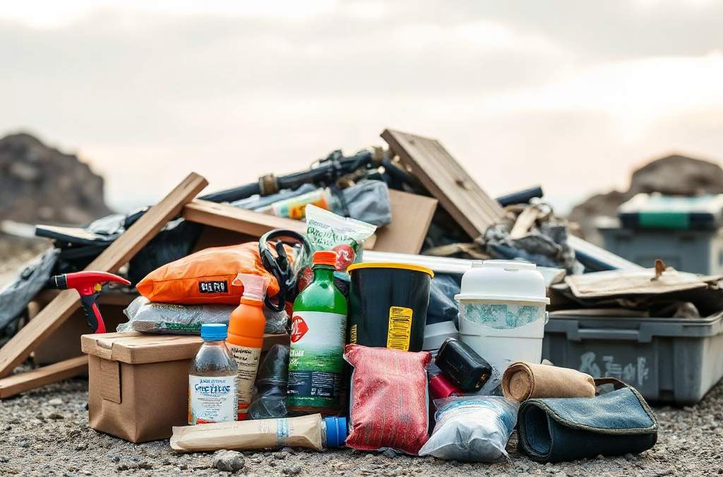
Consider the difference between a staged photograph and a labeled inventory. A staged photograph may show attractive containers and many products, but it can hide expiration dates, quantities, or missing pieces. A labeled inventory image can show the container, location, replacement date, and responsible person. The second format is less polished but more useful.
Build the image around actual constraints. A household with pets needs visible leashes, carriers, food, and vaccination records. Someone with diabetes, hearing loss, respiratory equipment, or refrigerated medication may need a specific storage and power plan, but medical decisions should follow advice from the person’s clinician or pharmacist. Do not assume that one universal kit meets every need.
Use a short priority system rather than a long unranked list:
- Leave or shelter safely: lighting, communication, essential medication access, and route information.
- Maintain basic needs: water, food suited to the household, sanitation, warmth, and infant or pet supplies.
- Restore routine: chargers, documents, tools, replacement batteries, and items for extended disruption.
Label the date of the last review on the image or its companion checklist. A photograph becomes misleading when the pictured batteries are gone, the kit has moved, or food no longer matches allergies and dietary requirements. Link Emergency preparedness images for household planning to a simple inventory process so the visual reflects what is truly available.
Designing Visuals for Different Hazards and Household Needs
Emergency visuals should reflect the hazards a household may actually face, because the correct action differs by event. A wildfire evacuation image may emphasize route choices, vehicle readiness, and meeting points. A severe storm image may emphasize shelter location, weather alerts, lighting, and staying away from windows. A flood visual may need higher-ground routes and warnings about driving through moving water. One generic “disaster plan” graphic cannot communicate all of these decisions accurately.
Separate shared actions from hazard-specific actions. A shared communication card can list out-of-area contacts, meeting locations, and emergency numbers. A hazard card can show the shelter room, evacuation direction, or the local warning source. Keeping these components separate makes updates easier when official instructions change or when the household moves.
Images also need to represent the people expected to use them. Large type, plain language, high contrast, and numbered steps can assist children, older adults, visitors, and people who process information more slowly under pressure. Do not rely on color alone to indicate danger or priority. Pair red, yellow, or green with words, patterns, or symbols. Avoid illustrations that suggest unsafe behavior, such as standing near a damaged utility line or returning to a building before it is declared safe by appropriate authorities.
For example, a household near a flood-prone road might create one image showing the route to higher ground and a second showing the supplies to take if leaving quickly. A family in an apartment may need a building exit map rather than a suburban driveway diagram. A rural household may need to show alternate roads because a single route can be blocked. These differences are not cosmetic; they change what the visual must communicate.
Use official local alerts and emergency-management information for hazard-specific instructions. An attractive homemade map should not override an evacuation order, shelter directive, or utility warning. The visual supports recall and coordination, while current authorities provide changing situational information.
Reviewing, Printing, and Updating the Visual Plan
Review turns a collection of images into a functioning household system. Schedule a short walkthrough at least when the household moves, changes sleeping arrangements, adds a pet, changes medication needs, or relocates supplies. Seasonal checks are useful for batteries, clothing, food, heating equipment, and weather-specific items.
Test the visuals instead of merely asking whether they look clear. Hand the map to someone who did not create it and ask that person to locate the emergency bag, identify two exits, and point to the meeting place. If the person needs an explanation, the image needs revision. Test a printed copy in grayscale and at its intended size. A graphic that works on a bright phone screen may fail when printed on ordinary paper.
Keep an editable master file and a small number of printed copies. Store paper versions in more than one accessible location, protected from moisture but not locked inside a container nobody can open quickly. A digital copy can be useful for travel or remote family members, but it should not be the only version. Phones lose power, passwords are forgotten, and cellular networks may be congested.
Use a change log or revision date. Check names, phone numbers, addresses, meeting locations, supply quantities, and route assumptions. Remove obsolete versions from visible locations so household members do not choose between conflicting instructions. A simple annual review is better than an elaborate design that no one maintains.
Finish by practicing one small scenario. Ask each person to find the image, name the first action, and identify who handles any special responsibility. If people disagree about the route or cannot locate an item, treat that as useful evidence rather than a failure. Update the graphic, explain the change, and practice again. The purpose of Emergency preparedness images for household planning is dependable shared understanding, not visual perfection.
Frequently Asked Questions
What should an emergency household map include?
Show primary and alternate exits, stairways, meeting points, emergency supplies, utility controls, and hazards specific to the home. Use labels and symbols that remain readable in print.
Are stock emergency images useful for household planning?
They can explain a general concept, but they cannot replace a map or inventory based on the household’s actual rooms, routes, equipment, pets, and accessibility needs.
Should emergency planning visuals be printed?
Yes. Printed copies remain available during power, device, or network failures. Keep a digital master for editing, but test printed versions for size, contrast, and accuracy.
How often should household preparedness images be updated?
Review them after a move, household change, route change, or supply relocation, and consider a seasonal check for food, batteries, clothing, and weather-related equipment.
How can images work for people with accessibility needs?
Use large type, high contrast, plain language, and more than color to convey meaning. Test the plan with the person who will use it and adapt responsibilities to actual capabilities.
Further Reading
Authoritative Sources
- Ready.gov Preparedness Guidance
ready.govOfficial household preparedness guidance, checklists, alerts, and emergency planning resources
- American Red Cross Emergency Preparedness
redcross.orgPractical emergency preparation, safety, and supply guidance for households
Conclusion
Effective emergency preparedness images show the household’s real decisions: where to go, what to take, who handles each responsibility, and how to find essential supplies. Begin with a readable home map and a prioritized inventory, then add hazard-specific routes and communication information. Print the working version, place it where people can reach it, and test it with someone who did not design it. Replace decorative graphics that do not guide action, and never let a homemade visual conflict with current instructions from local emergency authorities. A dated review, a short walkthrough, and clear labels will usually provide more value than a complex poster. The next step is to photograph or draw the actual supply location and exits, then revise the image until another household member can use it without explanation.
Related Content
- How to Evaluate the Long-Term Viability of Prepper Foods: Key Factors and Practical Steps
- How to Build Community During a Crisis
- How to Prepare for Unexpected Natural Disasters: Essential Steps and Checklists
- 10 Best Survival Preparation Tips (2025 Guide) to Ensure Your Safety
- Prepared for Anything: The Top 10 Items for Your Emergency Kit